VIVIENNE WESTWOOD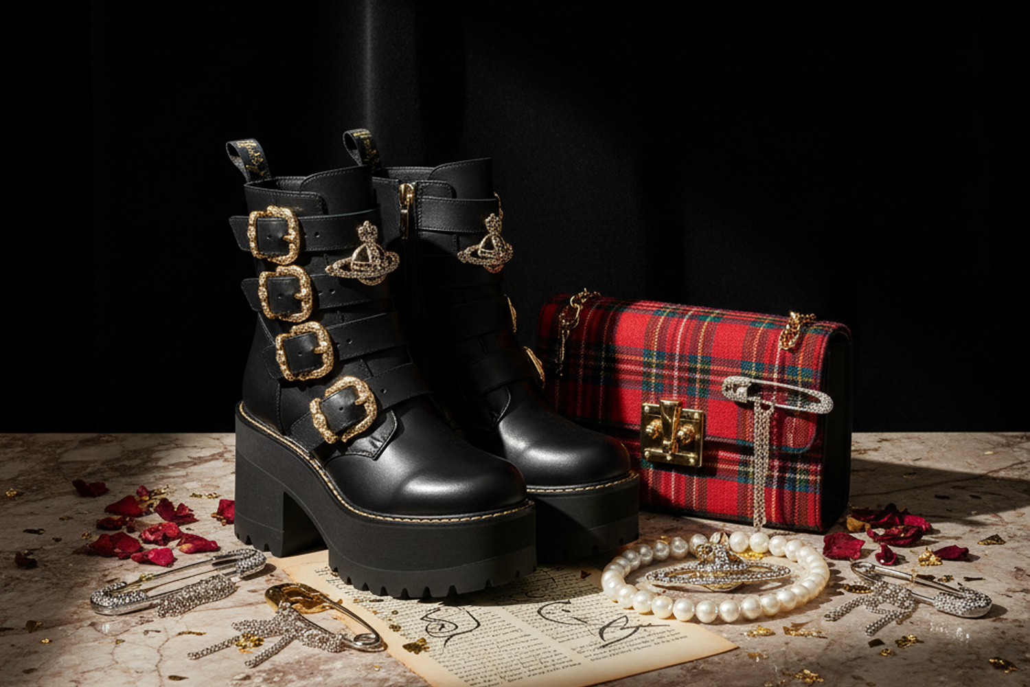
Brand DNA and Spatial Translation
Luxury Retail & Fashion
CLIENT TYPE
Vivienne Westwood, the British fashion house built on punk rebellion, historical tailoring, and political activism. The brief: read the brand’s history and identity closely enough to translate it into physical space.
THE CONCEPT
Vivienne Westwood began in 1970s London, when Vivienne Westwood and Malcolm McLaren opened a boutique on King’s Road that changed names repeatedly:
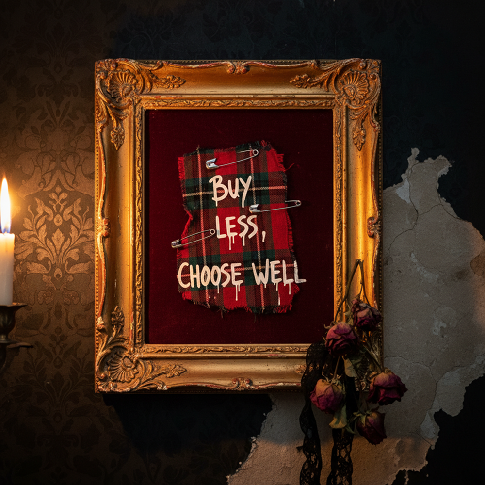
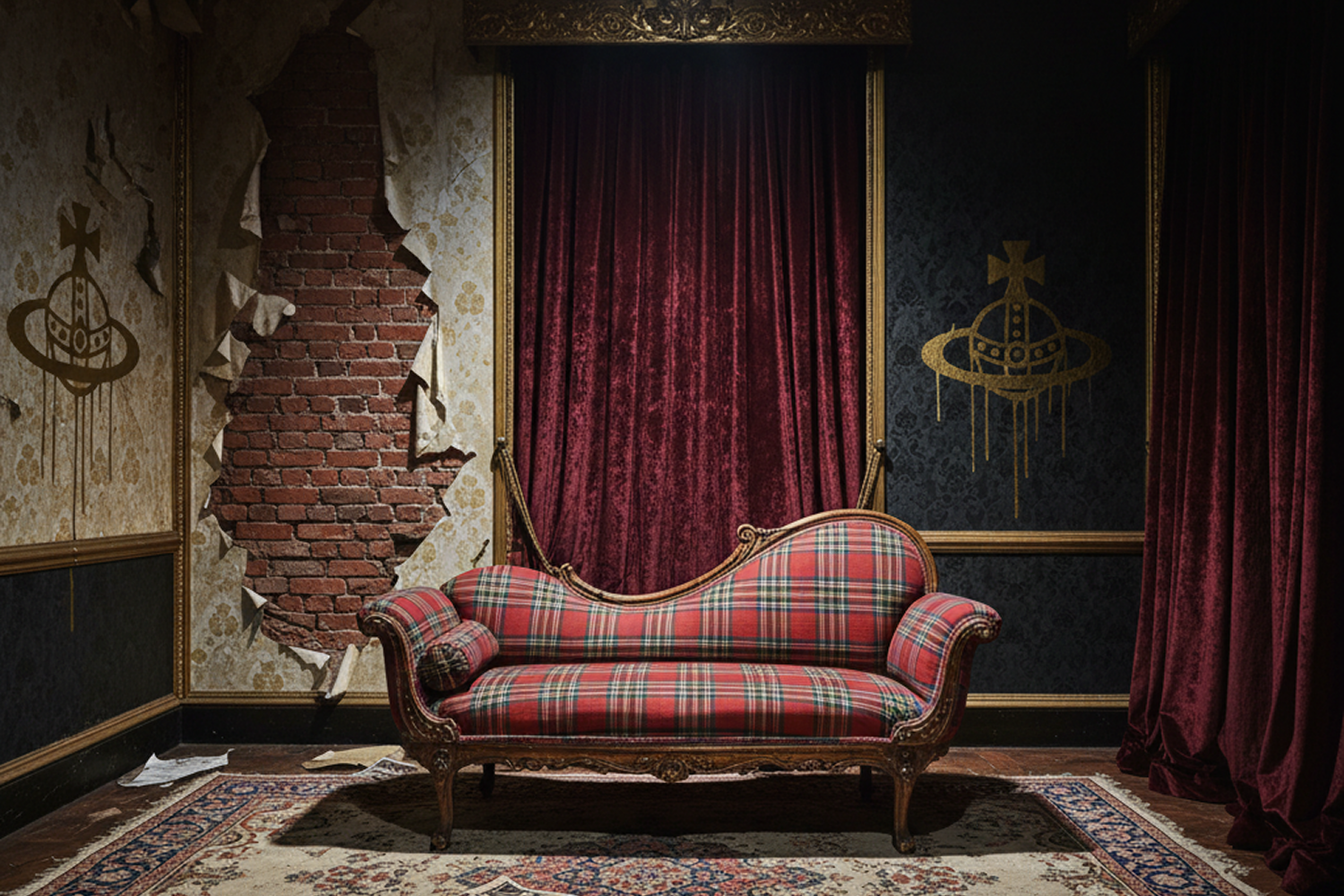
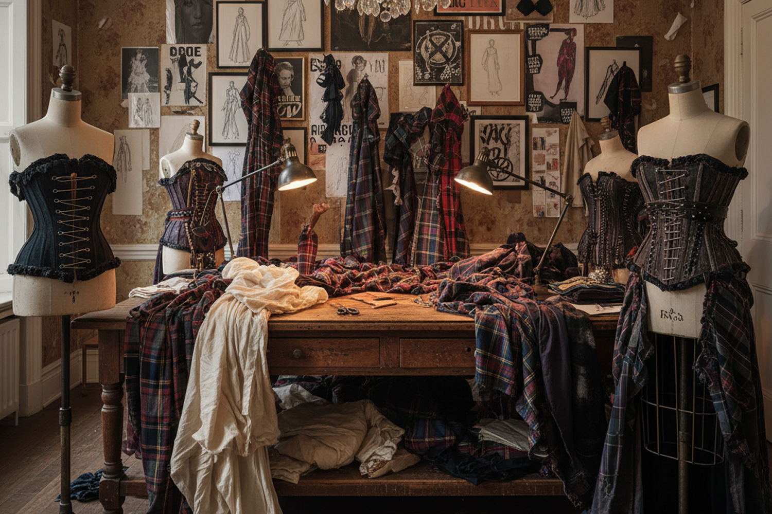
Let It Rock, then SEX, then Seditionaries, tracking the punk movement it helped create. From those rebellious roots, the brand evolved into a fusion of historical tailoring, intellectual critique, and political activism: anti-consumerism (“buy less, choose well, make it last”), climate and civil-liberties activism voiced through runway shows used as platforms for protest, and instantly recognizable signatures as the Orb logo, tartan, corsetry, deconstructed asymmetry.
SPATIAL TRANSLATION
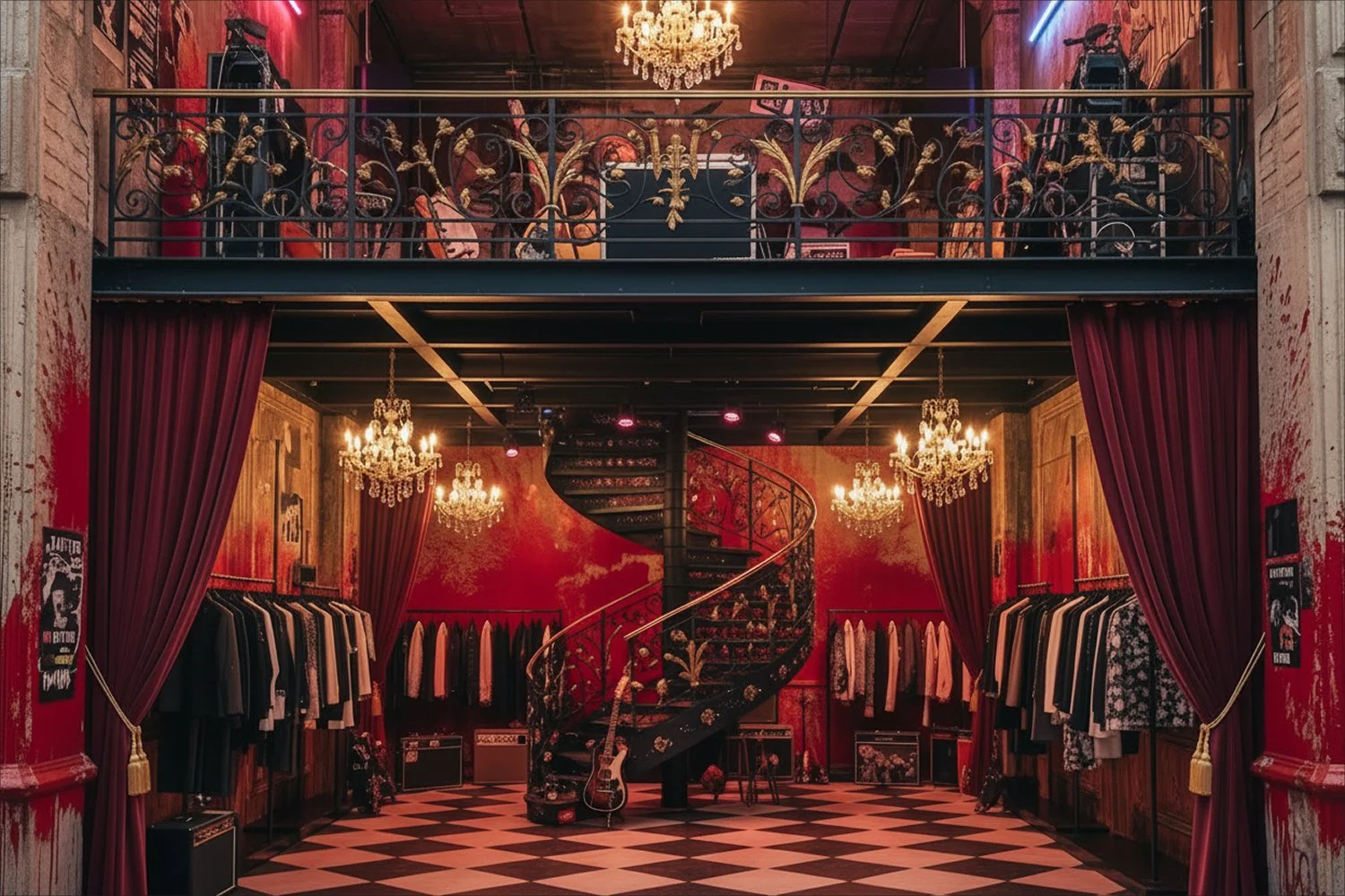
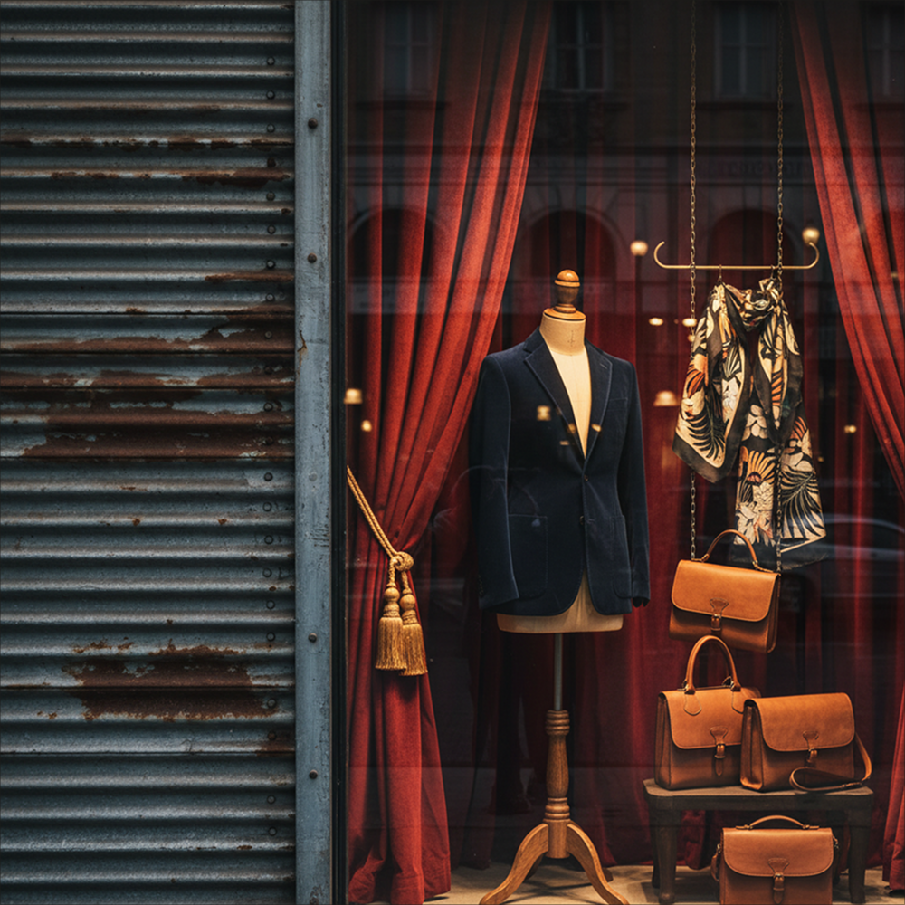
The design blends Westwood’s punk sensibility with baroque architectural elements; chandelier, crown molding, deliberately holding both registers in tension rather than resolving them.The result mirrors the brand’s own defining contradiction: reverence for historical craft and tailoring, disrupted by deliberate rebellion, chaos, and critique.
WHAT THIS DEMONSTRATES
Proof of Edit House’s Brand-World Diagnosis process applied to one of fashion’s most layered, ideologically dense brands reading a brand’s full history, politics, and visual codes, then translating that reading directly into a physical, spatial statement.
Vivienne Westwood is a trademark of its respective owner. Independent academic design project — not commissioned, affiliated with, or endorsed by Vivienne Westwood.
Project Date
Location